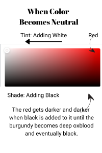
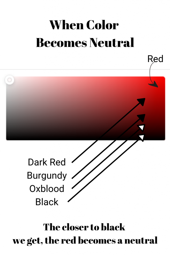
• Skip to main content
  • Skip to secondary menu
  • Skip to primary sidebar
  • Skip to footer

Best Look for You

Style Coach: Helping Women Love the Way They Look

  • Home
  • About
    • Reviews
  • Services
  • Workshops
  • Events
  • Blog
  • Contact
  • Cart🛒
  • Nav Widget Area

How to Dress for Deep Coloring

November 20, 2018 by Linda Crews | Style Consultant

If you have dark brown hair, dark eyes, and medium to deep skin tone for your ethnicity, you are probably a DEEP color code, like Marissa. As a DEEP Color Code, Marissa looks best in medium to low value contrast outfits in deep values. Value contrast is often overlooked in color analysis.


This lovely young lady is my photographer for my clients.

Value Contrast

Value refers how light or dark a color is. Using the gray scale found on many color wheels, we can identify our own features (hair, skin and eyes) and the colors in our outfits as light, medium or dark values. Think pale pastels (light value) to medium denims (medium value) to deep, dark colors like burgundy (dark value).

Value contrast refers to the difference (contrast) between two or more colors in terms of how light or dark those colors are in comparison to each other.

In an outfit, value contrast would refer to the comparative light and dark colors in each article of the outfit. You can ‘map’ the value contrast of the colors in your outfit just like we ‘map’ the value contrast in your own features (hair, skin and eyes).

The goal is to create harmony between the colors in your outfit and your own coloring.  When your outfit has similar value contrast as your own features it is ‘harmonious’ with your coloring.

What is color contrast
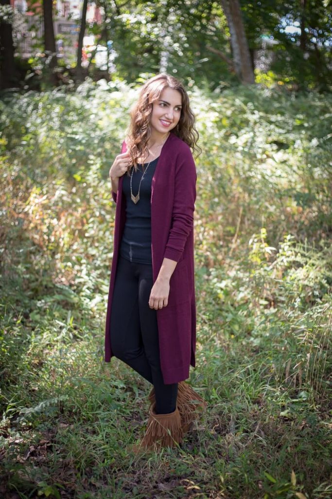
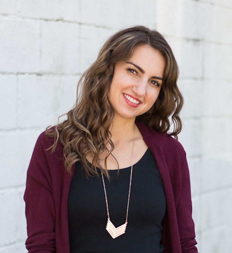
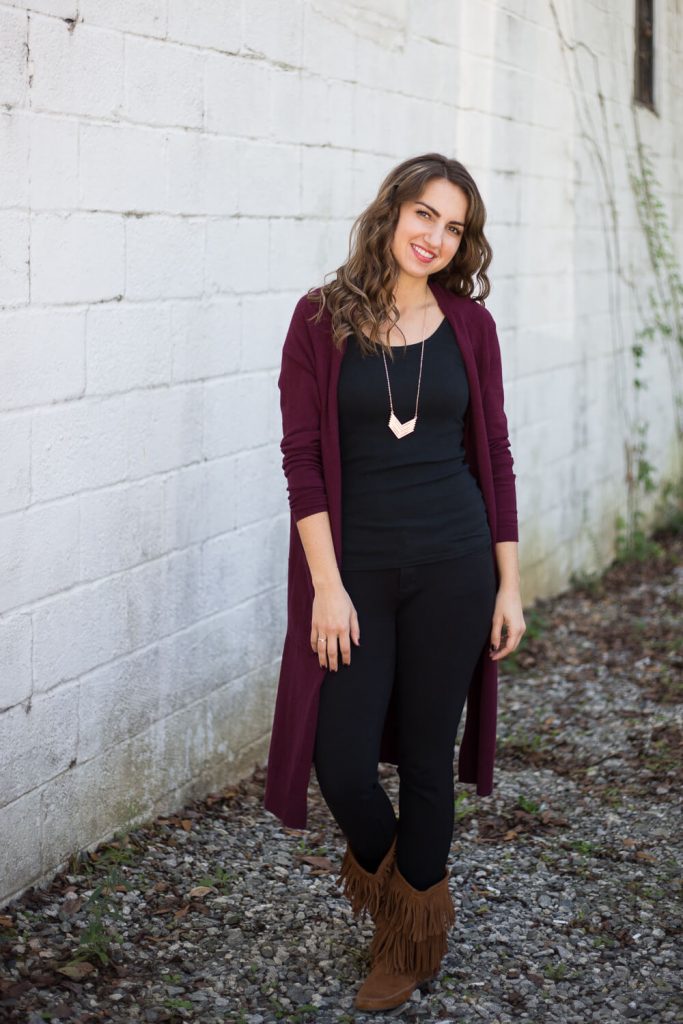
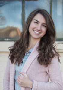
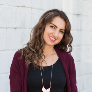
Marissa’s hair and eyes and eyebrows have little contrast in terms of light and dark. They are all dark brown.
Her skin tone is medium. Her personal coloring has a medium value contrast (the difference between the lightness of her skin and the darkness of her hair and eyes).  She has medium value contrast.
She will look best wearing medium value contrast in her outfits. That means the difference between the lightest and darkest colors in her outfits should be medium. Since her hair and eyes both are so dark, she will look best in deep, darker value colors.


Marissa in DEEP colors

Color Contrast

Color contrast refers to how many colors versus neutrals occur in her hair, skin and eyes. The best look for you is in harmony with your own color contrast. Let’s look at Marissa’s coloring.

You will notice that except for a tiny bit of highlights, she doesn’t have any color in her hair, skin or eyes. Therefore, she will look her best when wearing outfits that are monochromatic neutrals because she has low color contrast. If she wants to wear a little bit of color, like this burgundy cardi, she can add a little lippy in red. That will help add color harmony so that her outfit is related to her own coloring.


Marissa by wall


The outfit she is wearing is black with the adorable brown fringe boots and the burgundy cardi. This burgundy for her coloring is one of her pop colors. It makes her eyes, skin and hair color all pop. The amount of color works since the cardi is worn open and we see mostly the neutral black.


Did you know that the more black you add to a color, it becomes a neutral, as it approaches black? So this color in her cardigan is actually approaching a neutral. The contrast in value from light to dark between the black top and pants and burgundy cardi is medium-low. It is in harmony with her own coloring. She could actually wear a slightly higher contrast and still be in color and value harmony.
Color to Neutral


When you look at Marissa in this outfit, your eyes do not go first to the color she’s wearing. Instead we notice her face first. That’s the goal. I want to connect with her eyes. This is where we communicate not just our words but emotions. Wear clothes in colors that are in harmony with your own coloring and the attention will go to the eyes.


Overall Deep Value

Marissa in pastel

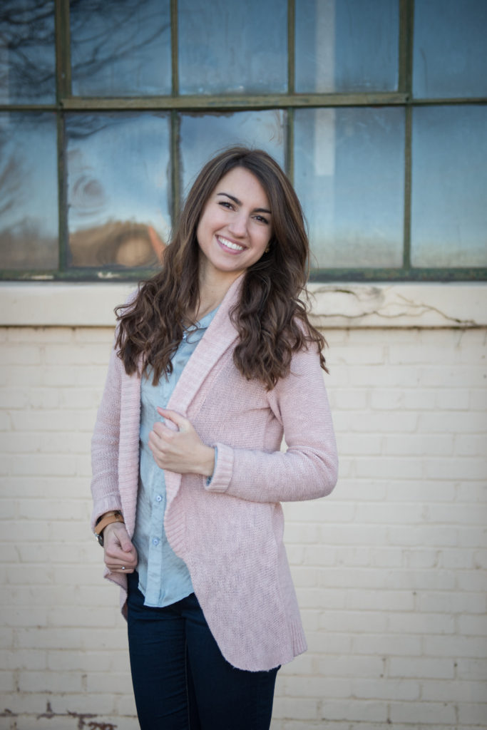
We can see in this pink cardigan and pastel blue top, the eyes are distracted to the outfit. The value contrast is so much lighter than her own. These lighter values wash her out and draw attention to the colors in her outfit away from her face.

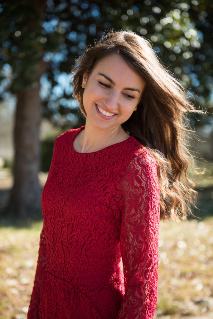
In a side by side comparison it’s easier to see that the overall deeper values (on the right) look more harmonious with her own coloring. The pastel lighter values (on the left) are a sharp contrast to her dark hair and eyes creating a disconnect from her own features. Wearing colors disconnected from your own features create body focus because the eye is drawn to the colors that are out of sync.

Marissa pastels cropped

What is color contrast

Marissa’s coloring is suited best for wearing all neutrals. She can wear color if she wants to with a few rule-breaking tips. First, she can wear some lippy in a berry color, which will add color to her above the shoulder area. Second, the best look will be to wear neutrals plus one color, or wear a monochromatic outfit in a pop color (which needs to be a deep value like her own). Check out this gorgeous red dress and how fabulous she pulls this off with a little lipstick.

marissa red dress

If you need a photographer for an event or portraits, consider Marissa Jean Photography. She is not only passionate about her photography but a delight to work with.

Filed Under: Client Transformations, Client Transformations Featured, Color Code

Primary Sidebar

Recent Blogs

  • 2023 Closet Outfit Planner
  • Start Your Style with Personality
  • 7 Reasons to Include Prints in Your Wardrobe
  • Make A Best First and Last Impression: Wear the Best Look For You Colors
  • What is Dressing in Visual Harmony?

Blog Categories

Footer

© 2025 · Best Look for You. View Terms and Privacy Policy